The American farmhouse style is a combination of architectural styles including Colonial, Greek Revival, Victorian, and Cape Cod. The eclectic nature of the farmhouse style stems from far-reaching roots as the style spread across different regions of the United States. Today, farmhouse-style house plans can be found in urban, suburban, and rural settings, traditionally characterized by clapboard-sided structures with steep roofs, wide porches, and dormers. The modern American farmhouse style lends itself to a variety of applications. At Frank Betz Associates, we have over 500 (!!!) farmhouse-style plans.
How do you achieve the quintessential Modern Farmhouse look? Farmhouse-inspired design has been around for a very long time. Light walls, timber beams, and contrasting metals embody this eclectic mix of contemporary and country, calm and cozy. The farmhouse design has specific features that help create a relaxed vibe and a cohesive style. It is a more sophisticated take on traditional country style. The ideal modern farmhouse style should balance practicality and rustic elegance, achieving the perfect combination of contemporary minimalism mixed with a warm, relaxed look. And the paint colors you choose are one of the biggest contributors to creating the Modern Farmhouse aesthetic.
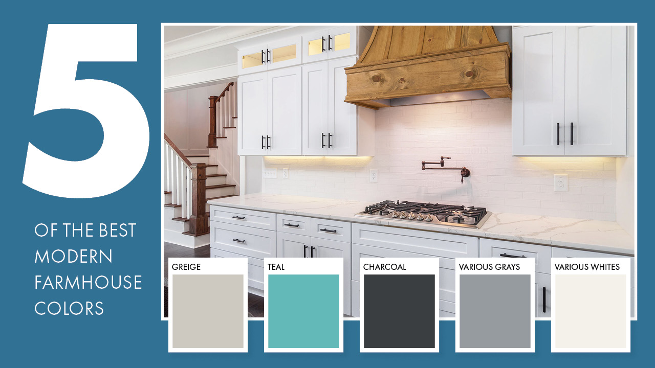
5 Of The Best Modern Farmhouse Colors

The farmhouse vibe — peaceful, relaxed, and no-fuss — suggests paint colors that exude warmth, coziness, and clean design. And while neutrals are the hallmark of farmhouse design, there are plenty of colors that can add some excitement to the look. Here are five of the hottest (coolest?) farmhouse paint colors:
- Greige. A blend of gray and beige, this neutral works anywhere. It’s light enough to maintain an airy vibe, but dark enough to add mood. One of the most popular modern farmhouse colors, it’s ideal for interior walls and areas like hallways. There are many variations to choose from. Some shades are cool with green or blue undertones, while others are warmer with red and yellow undertones.
- Teal. This muted shade of blue-green adds a touch of whimsy to a farmhouse. Softer teals are a great choice for a coastal farmhouse vibe in the kitchen, while lighter teal hues work well with beige or white in living rooms or bedrooms. Deep teal is a stunning choice for walls or painted cabinets.
- Charcoal. A dark, moody color, charcoal adds a twist to a modern farmhouse. Less harsh than traditional black, charcoal works well with lighter neutrals. While perhaps too much for all walls, it’s a great accent color for door and window trim, and mantels. If you want to use it on walls, make sure it’s a room that gets tons of natural light.
- Various Grays. Gray has so many hues, there is something for everyone. Classic gray is sophisticated. Light gray is popular, too. (Especially for cabinetry.) Gray-green is ideal for those who want something a little moodier. (Try it on cupboards, cabinets, or an accent wall.) Silver and pewter are less deep than gray, and are beautiful as neutrals or trim colors. Blue-gray livens up any space.
- Various Whites. Everyone knows that white works well as a backdrop. It lets accent colors (painted cabinets or brightly colored accessories) and wood finishes take center stage. There are as many shades of white as you could ever conjure – classic whites, off-whites, creams, beiges. Some whites are warmer, while others are cooler. There’s nothing “plain vanilla” about white and its many hues.
How To Choose Light vs. Dark Colors
While it’s no secret that a fresh coat of paint can make a house look entirely different, finding just the right color is the key. With millions of shades to choose from, making that choice can be overwhelming. Here are some tips for choosing your modern farmhouse exterior colors and interior colors.
1. Balance the interior with the exterior. Make sure that whatever hues/tones you choose for the outside coordinate with the palette you choose for the inside. While everything doesn’t have to be matchy-matchy, choosing a coordinated color scheme creates harmony.
2. Choose furnishings/decor. Pick out larger furnishings BEFORE you choose paint. Once you have most of your furniture choices, look at the colors and patterns. For example, pick a favorite shade from the area rug, or use upholstery for inspiration. You can also use the furniture to decide if you’re going to go light or dark, and/or warm or cool undertones.
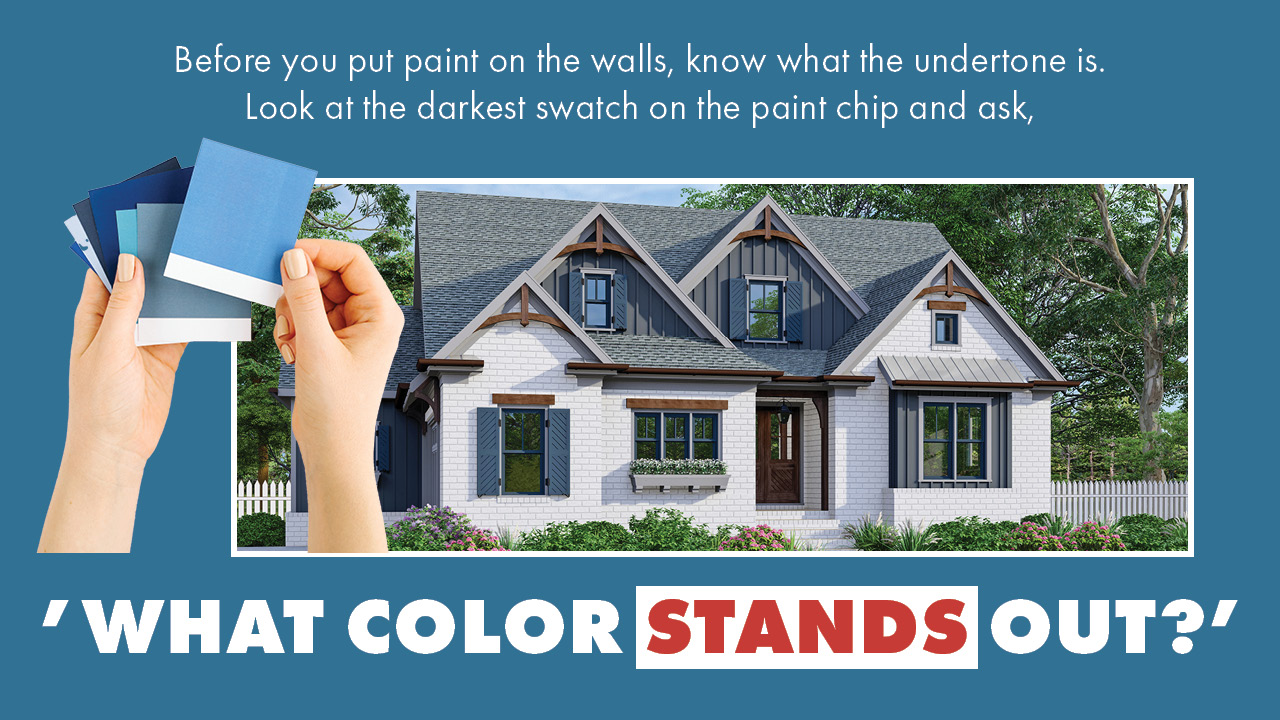
3. Find the undertone. This step is so important when picking a color scheme for modern farmhouse style. Before you put paint on the walls, know what the undertone is. Look at the darkest swatch on the paint chip. What color stands out? The color that immediately pops out is the undertone of the entire palette. If you look at that darkest color swatch and you detect red or green, even the lightest hue of the chip’s palette will have red or green in it. If you have a single swatch paint chip, find the undertone by putting it against a white sheet of paper. The undertone will still pop right out. If you want some green in your neutral, look for a swatch that has the darkest color looking green. If you’re picking a greige, find one that has taupe or brown.

4. Consider the lighting. What makes a color you love in one space look completely awful in another? The lighting! In a space with lots of light, the color painted on the walls will be much lighter. When the space is smaller, the light is weaker, and the color will look bolder. The size and number of windows, the direction they face, the size of the room, the ceiling height… all contribute to how light or dark a room looks. if you are painting a large room with lots of natural light, you can choose a darker paint color if you want. If it’s a smaller or darker room, choose a lighter color. Think about the light and what kind of mood you’re trying to create and choose accordingly.
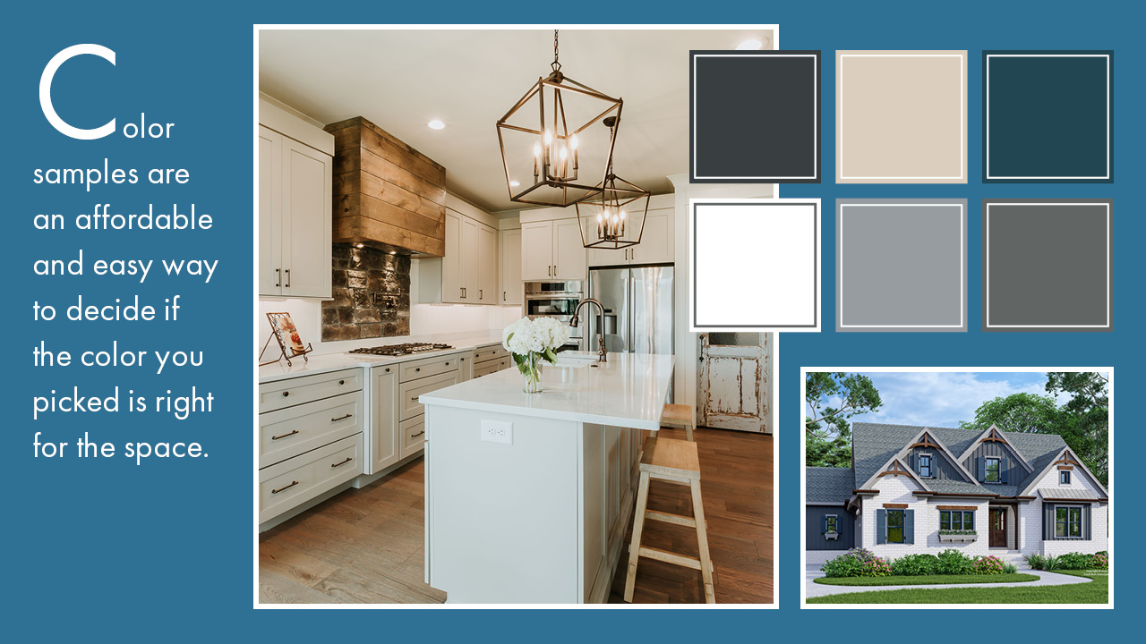
5. Get color samples. Color samples are a cheap and easy way to decide if the color you picked is right for the space. They save money and time. It’s smarter to paint sample coats than to paint the whole room and then repaint it because you don’t like it. Paint at least a 2×2 foot space on every single wall in the room with the colors you’re trying to decide on. Once it dries, look at the paint at different times of the day. By looking at how the color applies in different lighting conditions, you’ll get a sense of how it will look overall. Once you think you have it narrowed down to “the one”, get a shade lighter and a shade darker of that same color and test it to decide if it really is “the one” or if you maybe prefer to go lighter or darker

6. Then, go lighter. You found “the one”. But is it? Keep in mind that when you paint the walls, that color will dominate the room. If you really love a saturated or dark color, you can probably achieve the same goal by going up one on the swatch. It will be in the same family, have the same undertones and not be too much for the room. A similar option would be to have the paint counter lighten the color you chose anywhere between 25-50%. It may change the tone just a tad, but you’re not going to notice and it won’t be drastic.
Frank Betz Associates Is Ready To Work With You!
If you are interested in building a custom home and learning how our talented team can help you achieve the Modern American Farmhouse-style home of your dreams, Frank Betz Associates is ready to work with you, so contact us today.